Celebrating 20 years of UXINDIA Celebrating 20 years of UXINDIA Celebrating 20 years of UXINDIA Celebrating 20 years of UXINDIA
Celebrating 20 years of UXINDIA Celebrating 20 years of UXINDIA Celebrating 20 years of UXINDIA Celebrating 20 years of UXINDIA
Celebrating 20 years of UXINDIA Celebrating 20 years of UXINDIA Celebrating 20 years of UXINDIA Celebrating 20 years of UXINDIA
Celebrating 20 years of UXINDIA Celebrating 20 years of UXINDIA Celebrating 20 years of UXINDIA Celebrating 20 years of UXINDIA
Celebrating 20 years of UXINDIA Celebrating 20 years of UXINDIA Celebrating 20 years of UXINDIA Celebrating 20 years of UXINDIA
Celebrating 20 years of UXINDIA Celebrating 20 years of UXINDIA Celebrating 20 years of UXINDIA Celebrating 20 years of UXINDIA
Celebrating 20 years of UXINDIA Celebrating 20 years of UXINDIA Celebrating 20 years of UXINDIA Celebrating 20 years of UXINDIA
Celebrating 20 years of UXINDIA Celebrating 20 years of UXINDIA Celebrating 20 years of UXINDIA Celebrating 20 years of UXINDIA
Celebrating 20 years of UXINDIA Celebrating 20 years of UXINDIA Celebrating 20 years of UXINDIA Celebrating 20 years of UXINDIA
Celebrating 20 years of UXINDIA Celebrating 20 years of UXINDIA Celebrating 20 years of UXINDIA Celebrating 20 years of UXINDIA
Celebrating 20 years of UXINDIA Celebrating 20 years of UXINDIA Celebrating 20 years of UXINDIA Celebrating 20 years of UXINDIA
Celebrating 20 years of UXINDIA Celebrating 20 years of UXINDIA Celebrating 20 years of UXINDIA Celebrating 20 years of UXINDIA
Celebrating 20 years of UXINDIA Celebrating 20 years of UXINDIA Celebrating 20 years of UXINDIA Celebrating 20 years of UXINDIA
Celebrating 20 years of UXINDIA Celebrating 20 years of UXINDIA Celebrating 20 years of UXINDIA Celebrating 20 years of UXINDIA
Celebrating 20 years of UXINDIA Celebrating 20 years of UXINDIA Celebrating 20 years of UXINDIA Celebrating 20 years of UXINDIA
Celebrating 20 years of UXINDIA Celebrating 20 years of UXINDIA Celebrating 20 years of UXINDIA Celebrating 20 years of UXINDIA
20 years of UXINDIA
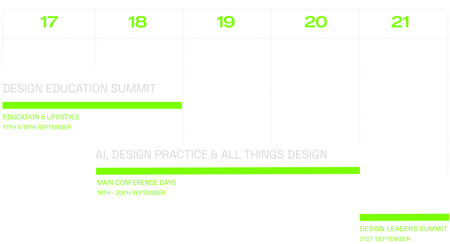
Dates:
17-21st September
Celebrating 20 years of UXINDIA Celebrating 20 years of UXINDIA Celebrating 20 years of UXINDIA Celebrating 20 years of UXINDIA
Celebrating 20 years of UXINDIA Celebrating 20 years of UXINDIA Celebrating 20 years of UXINDIA Celebrating 20 years of UXINDIA
Celebrating 20 years of UXINDIA Celebrating 20 years of UXINDIA Celebrating 20 years of UXINDIA Celebrating 20 years of UXINDIA
Celebrating 20 years of UXINDIA Celebrating 20 years of UXINDIA Celebrating 20 years of UXINDIA Celebrating 20 years of UXINDIA
Celebrating 20 years of UXINDIA Celebrating 20 years of UXINDIA Celebrating 20 years of UXINDIA Celebrating 20 years of UXINDIA
Celebrating 20 years of UXINDIA Celebrating 20 years of UXINDIA Celebrating 20 years of UXINDIA Celebrating 20 years of UXINDIA
Celebrating 20 years of UXINDIA Celebrating 20 years of UXINDIA Celebrating 20 years of UXINDIA Celebrating 20 years of UXINDIA
Celebrating 20 years of UXINDIA Celebrating 20 years of UXINDIA Celebrating 20 years of UXINDIA Celebrating 20 years of UXINDIA
Celebrating 20 years of UXINDIA Celebrating 20 years of UXINDIA Celebrating 20 years of UXINDIA Celebrating 20 years of UXINDIA
Celebrating 20 years of UXINDIA Celebrating 20 years of UXINDIA Celebrating 20 years of UXINDIA Celebrating 20 years of UXINDIA
Celebrating 20 years of UXINDIA Celebrating 20 years of UXINDIA Celebrating 20 years of UXINDIA Celebrating 20 years of UXINDIA
Celebrating 20 years of UXINDIA Celebrating 20 years of UXINDIA Celebrating 20 years of UXINDIA Celebrating 20 years of UXINDIA
Celebrating 20 years of UXINDIA Celebrating 20 years of UXINDIA Celebrating 20 years of UXINDIA Celebrating 20 years of UXINDIA
Celebrating 20 years of UXINDIA Celebrating 20 years of UXINDIA Celebrating 20 years of UXINDIA Celebrating 20 years of UXINDIA
Celebrating 20 years of UXINDIA Celebrating 20 years of UXINDIA Celebrating 20 years of UXINDIA Celebrating 20 years of UXINDIA
Celebrating 20 years of UXINDIA Celebrating 20 years of UXINDIA Celebrating 20 years of UXINDIA Celebrating 20 years of UXINDIA
The 20th Year Of
India’s Biggest UX Design Conference
Save The Date
17-21st SEPT
In its 20th year UX INDIA 24 is going grand. In this week-long celebration, we’ll see design Community and leading Corporations & Industries coming together. We will collectively continue the journey of spreading the message of good design globally.
Theme
Design - A Way of Life
Marking its 20th annual international conference, UXINDIA embraces “Design – A Way of Life” as its central theme. This milestone event calls upon designers and innovators from diverse backgrounds to share their evolutionary journeys and visions for the future. Our sessions will focus on real-life, impactful stories that have touched lives and left a lasting mark. Our aim is to ignite and inspire the vibrant, upcoming generation of designers, encouraging them to broaden the scope and impact of design in the future.
Spanning over five days, the celebrations will delve into all facets of design. We’ll explore narratives from AI and Design, Customer Experience (CX), mainstream User Experience (UX), various industry verticals, and beyond. These stories will not only enhance our understanding but also reinforce our theme, “Design – A Way of Life,” widening our perspectives and amplifying our commitment to design in every aspect of living.
We welcome corporates, designers, researchers, creative technologists, data scientists, artists, and activists to share their insights to make UXINDIA 2024 the most impactful UX Conference.
Pitch Your Talk
Are you interested in joining our expert speaking faculty of over 100 speakers presenting in multiple session formats over 3 days?
The talk submission deadline has been extended to May 15.
We are seeking your proposals for an interactive and engaging session during UXINDIA24. Our platform is open to new voices and subjects who wish to talk about all things design.
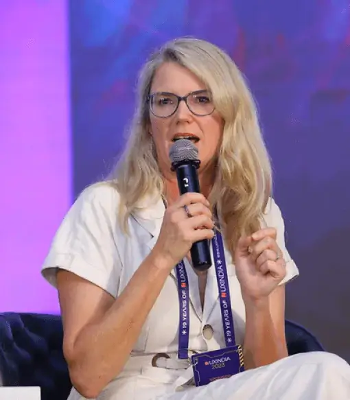
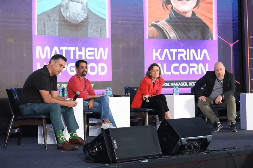
UXINDIA23 emerged as the biggest UX Design conference in India. With an in-depth talk on UX, AI and Design, we saw participation from top design leaders from organizations like JP Morgan Chase, IBM, Infosys, Publicis and more